I’ve been hearing about all the technical problems on health exchanges since they launched on Oct 1. I was curious, especially because I live in Maryland- which is way ahead of the game and providing an example to other states. I also know folks involved in developing HealthCare.gov which is one of the best government web sites I’ve ever seen. (UPDATE: It has lots of problems too. Just not the design problems I talk about below.)
So, I went to MarylandHealthConnection.gov to see what my choices might be and how the site worked. Let’s just say this up front: it doesn’t. Here is a list of issues I encountered during a 15 minute attempt that ended with a server failure:
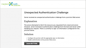
- Multiple server failures before I started the enrollment process. I finally got to a screen to get started. So, the system can’t deal with the scale of requests even days after launch. I’m not into the conspiracy theories about tea-party-ers paying hackers and bots to attack the sites, but it sure would be a comforting explanation! But crappy software looks just like this.
- Aggressive “pop-up” interactions as I tried to click on “I’m an individual or family” as my mouse crossed the “I own a small business” side of the screen that obscured the choice I wanted. By the way, these are not mutually exclusive choices, and “I” cannot be a “family.” A better choice would be “I need insurance for myself or my family” and “I need insurance for my small business.”
- No one with a 4th grade reading level could understand this site, or navigate it successfully. It’s full of bureaucratic terms that only people in the health insurance industry would even begin to understand.
- I’m asked about my “Consent for Automated Verification.” Basically, I have to say that I consent to automated mining of information about me and my family to verify who I am. And I have to say whether I consent for 1, 2, 3, 4, or 5 years. Huh? How about just for the duration of the application process? I chose 1 year.
- After consenting, it requires a whole bunch of identity “proofing.” Jargon, anyone? Basically, it’s trying to ensure that I’m really me. It asks for lots of personal information right up front, including my Social Security Number, which immediately made me glance at the address bar to make sure it’s an HTTPS connection (it is). It then asks me some “proofing” questions based on a database that knows A LOT about me, including previous addresses – but not my current cell number. I had to guess at a previous phone number as a choice and got lucky.
- Next, I had to choose if I was a special type of person, like a provider or counselor, or an individual. The correct choice was a smaller button with the same visual styling – and it appeared second. Who do they think the primary user is? Holy cow.
- Now, I’m into the form filling part of the system. It’s got a weird navigation model that slides new form elements up onto the screen as you finish previous sections. I’ve never seen anything like it; it was jarring and confusing. But I sucked it up and continued.
- Form fields are laid out all over the screen, with a tab order of left to right, top to bottom. A single column of fields would be much better, and laying out an address in a zig zag pattern is just weird.
- None of the data was filled in from my prior entries or the obviously comprehensive database they used for “proofing.” I had to enter it all again.
- I had to enter both my zip code and my county. It later told me that my zip code was not in the county I chose. I had to lie about the county to continue.
- All the phone number fields were broken out into three separate fields – area code, exchange, and number. I kept getting errors that “phone numbers should be entered in the form of XXX-XXXX” even though all three I entered were correct numbers. I couldn’t proceed until deleting all the phone numbers. Looking back, that third field must have been for “extension” instead, but I can’t verify that was the problem. Also, the errors were shown at the top of the screen with no indication of which specific fields were in error.
- I got beyond that to the point where I would have to enter my spouse’s information… and the system crashed again. I wonder what happened to all that sensitive information I entered. Lost? Insecure? Saved? Who knows?

So, I failed to enroll. And I have no interest in trying again – luckily I currently have insurance through my wife. Woe to anyone trying to do this on their own, and woe to the counselors who have to do this dozens of times a day.
